Why we hired a (real) illustrator
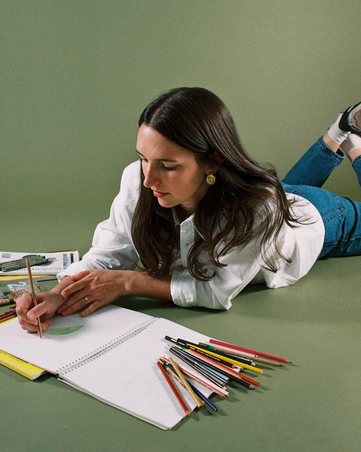
In this issue of Fruit for Thought, we’re diving into one of our favorite internal projects, our custom fruit illustrations created by the talented Louisa Cannell.
Why create custom illustrations?
AGP’s evolved considerably over the last year. We’ve hired new talent, explored new niches, and broadened our expertise.
It was important to update our look and feel to reflect this version of our brand. We’re always preaching the benefits of refreshing an identity to communicate its value properly.
Basically, it was time we took our own advice.
Custom illustrations add distinctive character to a brand in a way that stock imagery or generic graphics can’t replicate. They can become as recognizable as a logo. Think of Headspace’s slow-breathing character Ebb, or Mailchimp’s winking icon, Freddie. Illustrations like these give brands creative flexibility to express tone and emotion. They serve the classic adage: show, don’t tell.
We’ve had so much fun growing our brand organically, introducing new design elements that feel fresh and timely. But we started to feel like the brand’s playful essence, embodied in cheeky fruit puns, vibrant colors, and light-hearted design elements, needed a bit of refinement. We wanted a set of icons, images, or illustrations to create cohesion. Ones that were uniquely and recognizably A Good Pear.
Louisa’s pear-spective
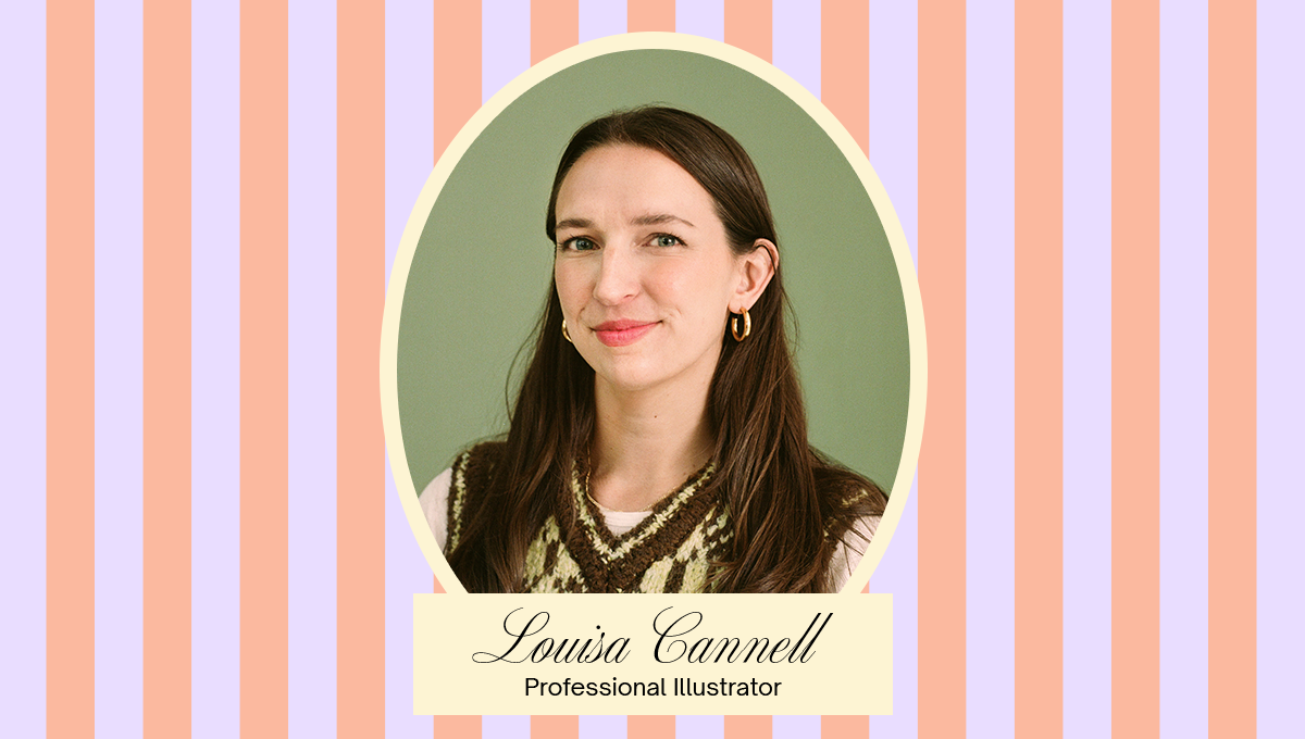
That’s where Louisa comes in. As a studio run by—gasp!—real people, it was important for us to collaborate with a professional illustrator whose experience and expertise could shape the project.
We find that the best work gets done when everyone is in their zone of genius. For us, that’s art direction. We crafted the brief and guided the process, while Louisa worked her magic, bringing the illustrations to life.
Hand-drawn ink sketches
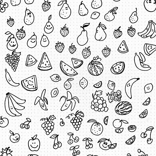
First, she warmed up by sketching different fruits and experimenting with varied facial expressions.
She gave us many sketch options to choose from so that we could control the energy each little cutie gave off. Did we want them to feel silly? Sweet? Serious? How should the teeth look? How big is the smile? Are they symmetrical or oblique? Each micro-decision would impact the overall aesthetic of the illustration, changing the mood and emotion it conveys.
Coming to fruition
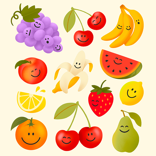
Next, Louisa cleaned up the hand-drawn sketches electronically and added our colors. Typically, a smaller color palette makes illustrations feel cohesive and recognizable. A challenge here was creating designs that felt distinct from the countless fruit graphics you’ve seen in the world. She also had to strike the perfect balance between cartoon and realism—not too animated that they feel unprofessional, not too life-like that they lose their “cute” factor.
The fruit salad
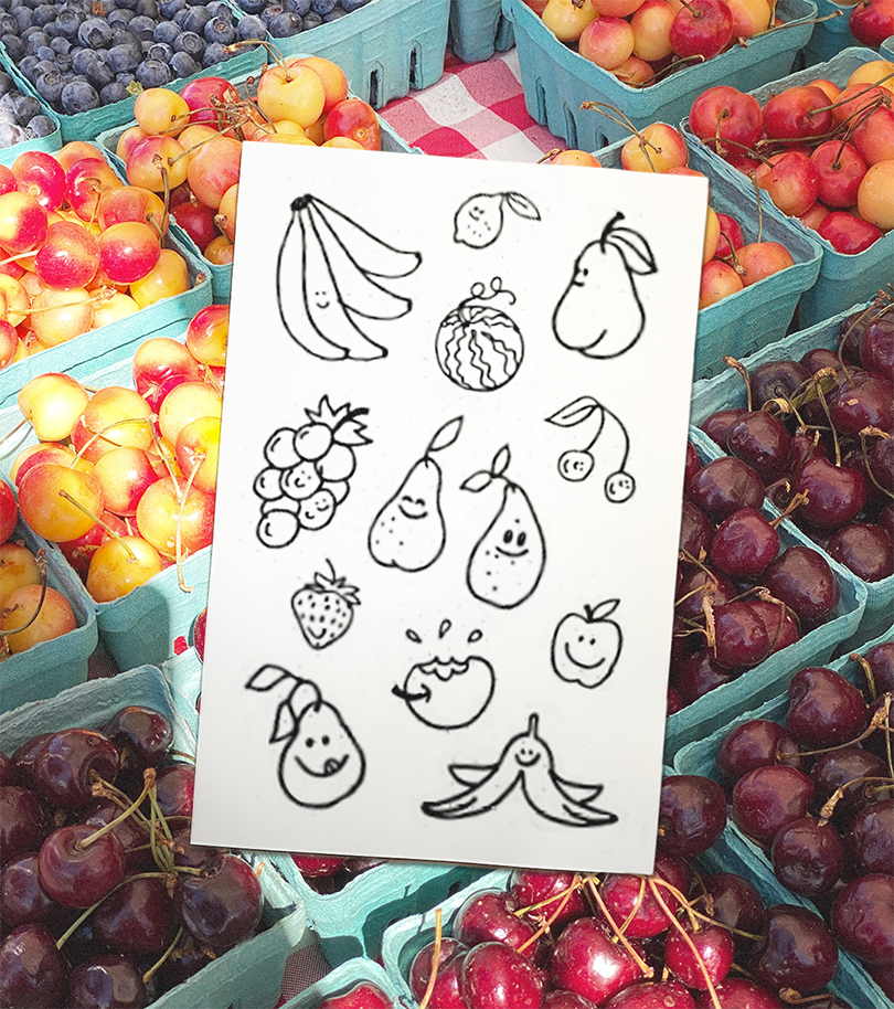
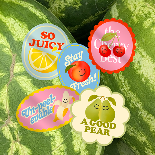
Ultimately, we landed on 15 fruit illustrations that we transformed into 5 fruit stickers. These assets are multipurpose: they live on the website, social media, and on physical merch.
We also use them internally. Each of our collaborators, our copywriter, intern, motion designer, and graphic designers, has chosen their own fruit. It’s a little nod to our overall philosophy: individually, our work is sweet, but together, we make the juiciest combo: layered and full of flavor.
What do you think of our fruit illustrations? Have you ever considered incorporating illustrations into your brand identity? Let us know!
Getting ins-pear-ed?
Join the Fruit for Thought newsletter where once a month we'll share creative inspiration, new work, and stories from the gals behind the studio. We hope to see you there!