Can you create an entire brand system in 3 hours?
This summer, we’ve been thinking a lot about creativity.
Our business is fueled by it, our feeds are full of (and sometimes sorely lacking) it, and we’re inundated with information about how to optimize, speed up, and enhance it.
But what online discourse misses is the idea that creative work can, and should, be FUN.
In our collective efforts to speed everything up with AI, we’ve forgotten that art is subjective, that people bring unique and interesting perspectives to their work, and that our experiences shape how we approach and solve problems.
And maybe there’s a time and a place for this tech, that’s a conversation for another day, but it has got us thinking about what we can do as a studio to get our creative juices flowing, naturally.

What happens if we sprint?
For a while now, we’ve been noodling on a fun idea: what if we created a brief for a fictional business, then gave ourselves, like, 3 hours MAX to create a brand for it?
Usually, we take months to work on an identity project. That gives us time for research, strategy, art direction, design, feedback, and edits. But what if we had to produce something, love it or hate it, in only a few hours?
Ready or not we’re doing it.
So that’s exactly what we did.
Here’s how:
To determine the specifics of our invented company, the project was divided into three sections: personality, category, and twist.
Each “section” had 6 possible options. We pulled each one from a hat (our AGP Fresh to the Core™ hat, of course) to get a whacky, completely invented, surprise brief. Would we be designing a brand for a moody boutique hotel in the desert? An earthy pilates studio for dog lovers? It was up to fate to decide.
We were absolutely delighted when we each pulled our piece of paper and got a shockingly coherent collection of words: chic natural wine package inspired by summer camp.
First up: Olivia! Our strategist had only one hour to name this new cutie.
This might sound easy. It’s one, maybe two words…how hard can it be?! The answer is: extremely. Like a tagline, a brand name has to distill a company’s entire essence, mission, perspective, and personality into as few words as possible.
The process usually involves a tremendous amount of research to establish what naming conventions exist in the category (and how to break them strategically), a TON of staring into space while hoping that a brilliant idea falls into your lap, a lot of brainstorming good-to-medium-to-bad ideas, and then lots of refining to find a shortlist of workable options.
But there was no time for that. After a few minutes spent scrolling through her favorite bottle shop for “research,” she asked herself: “what words or ideas come to mind when I think of summer camp?”
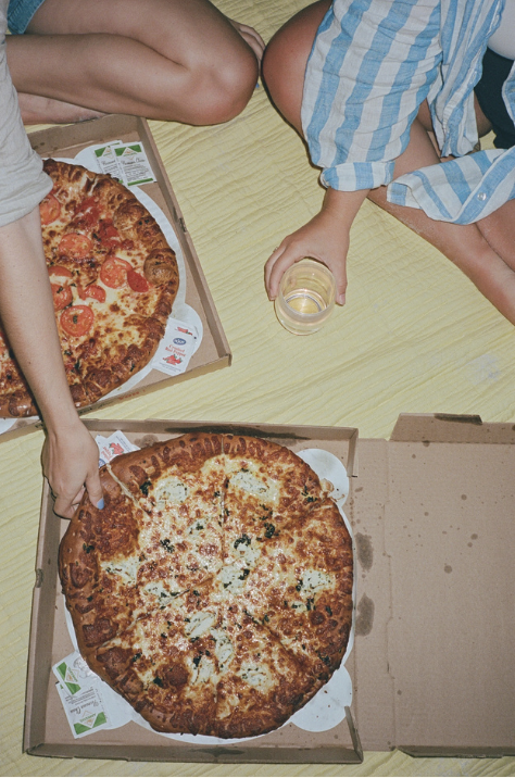
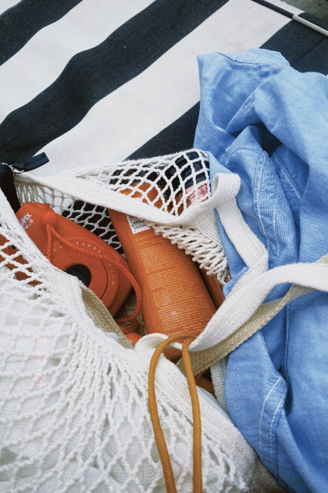
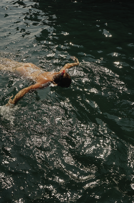
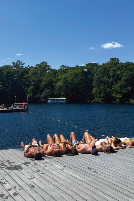
The real goal? Capture a feeling.
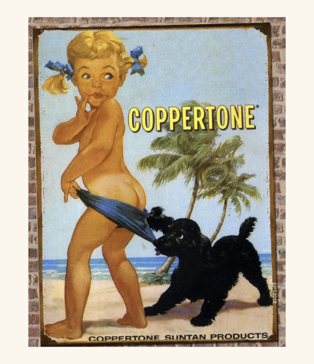
From there, she had a strike of inspiration: one thing that evokes the uncomplicated nature of childhood summers is the smell of sunscreen. She started researching Coppertone and their iconic/questionable ‘50s ads when she thought of something else: hop scotch, jumping rope, patty cake and other games young girls might play.
After a few minutes spent playing around with these ideas, she landed on the brand name for our chic new orange wine: Copper Pattie.
Time to pass the baton on to Kelly.
Speedy strategy
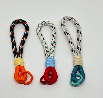
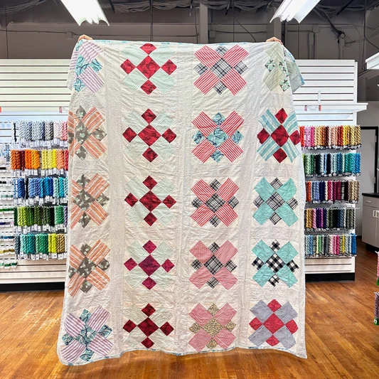
With the clock ticking, Kelly spent the first few minutes reflecting on Olivia’s strategy. She focused on a few key words that Olivia surfaced during her presentation; “girlhood,” “magic,” and “sunscreen,” and started thinking about how those could look visually. One thought that sprung to mind was cozying up under a handmade quilt after a long day in the sun.
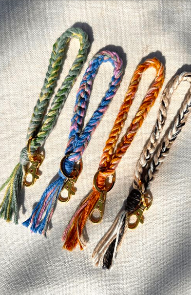
Usually, research and exploration takes hours, but instead, Kelly was forced to trust her instincts. She decided to lean into the idea of knitting, weaving, and crocheting, imagining girls banded together making keychains and friendship bracelets.
Research & scrappy sketching
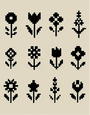
Next, Kelly started googling cross stitching to understand how these classic patterns are designed. This is usually when she’ll start sketching logo options (sometimes between 30-50!) before choosing 6-8 to present to the client.
But with such limited time, she jumped right into creating a digital logo. She thought of exploring a mark that featured a girl’s braid, but quickly dismissed it once she realized that without time for refinement, it might end up looking like the Wendy’s logo (not the chic vibe we were going for).
Instead, she opted for a simple mark that looks like a cross stitched sun to tie everything together.
Colors so delish you wanna eat ‘em up
The final step for Kelly was the wordmark and brand colors. She found the font Barur, which felt crafty and fun. Typically, we’d create custom lettering or modify an existing font, but for this exercise Barur got the job done.
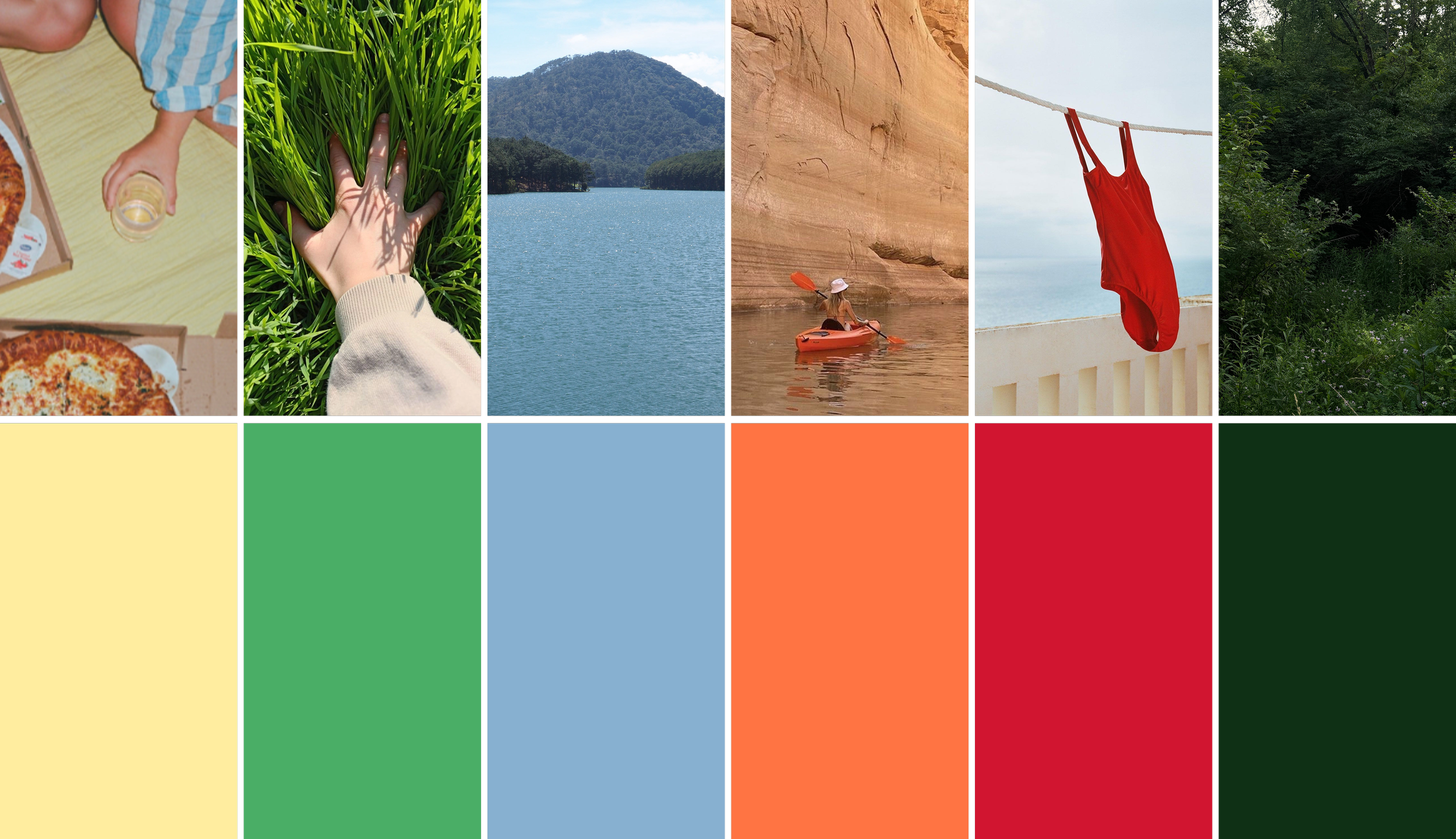
The color palette was inspired by pictures Kelly found of handmade keychains, bold primary colors that also had a little nod to bright vintage quilts.




One perk of a fictional project: there’s no budget. Like, no money to spend but ALSO the sky’s the limit. So Kelly suggested that Jenna add a keychain detail to the bottle design…and now it’s up to her!
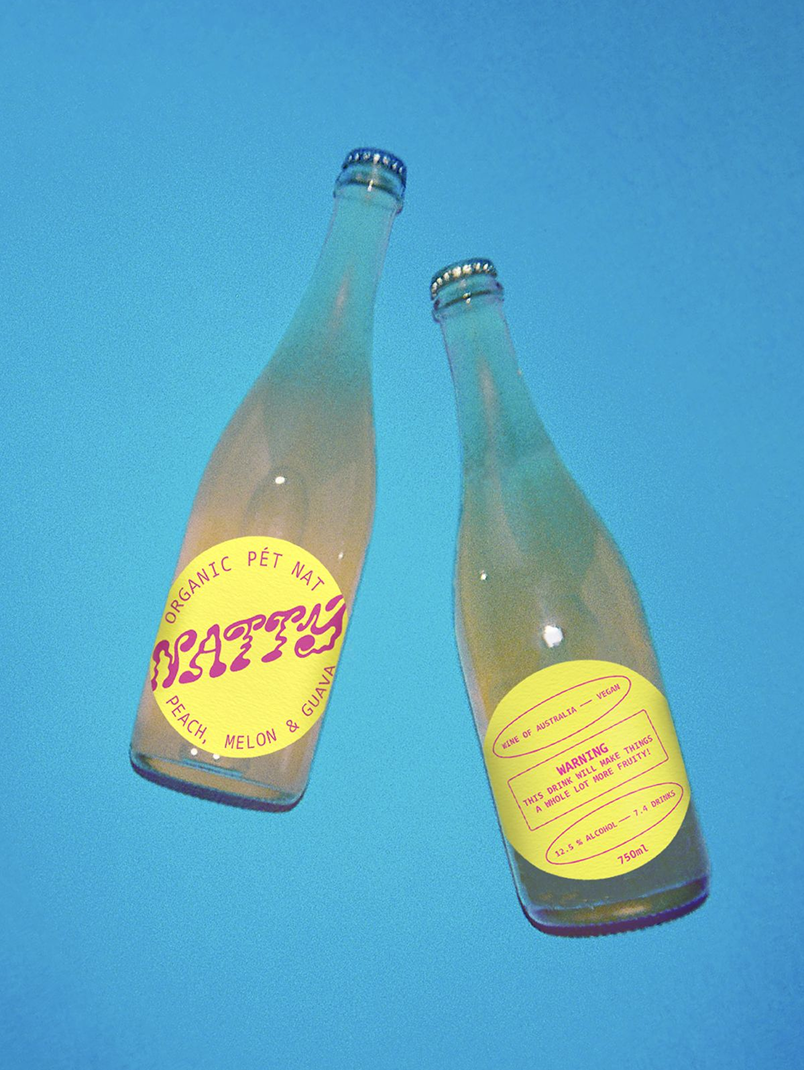
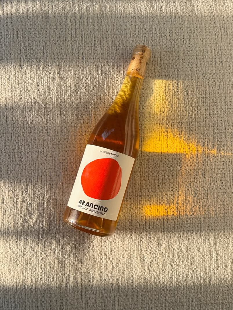
Jenna started by researching natural wine bottle styles to choose one that felt right for this up-and-comer.
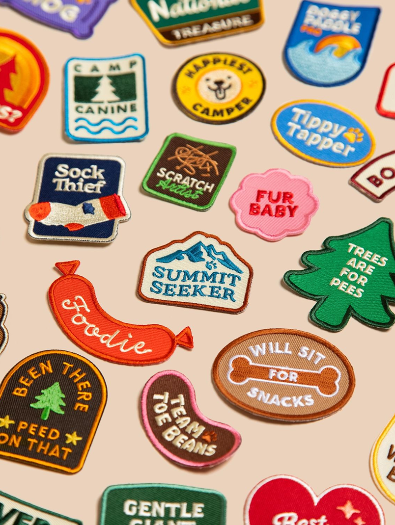
She thought of making the label look like girl scout badges and building out a system of designs for different flavors. She thought of exploring fun shapes or die cuts to make something really unique.
Constraints (hello time + budget) might spark something magical
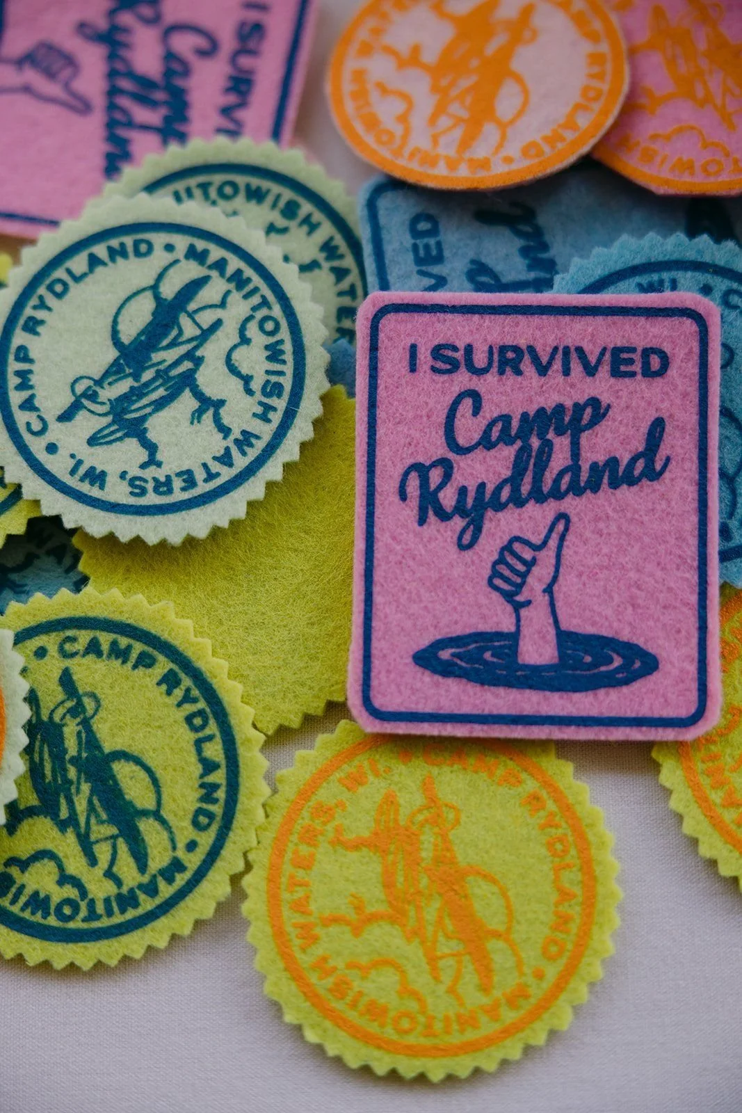
“WELP,” she said audibly. Reality has set in. With only an hour, she instead created a stamp shape. It felt crafty, tactile, and also brought to mind sending letters home from camp.
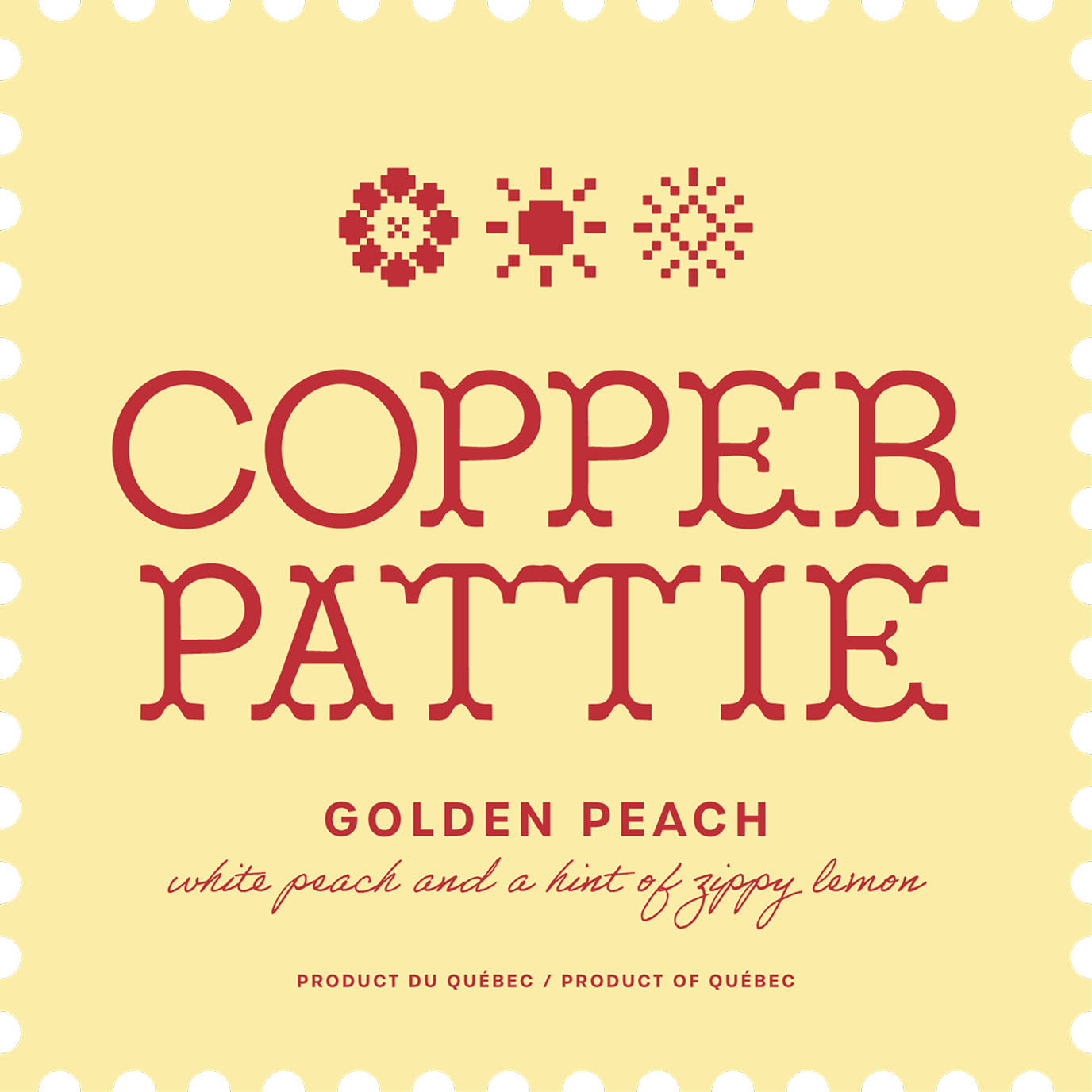
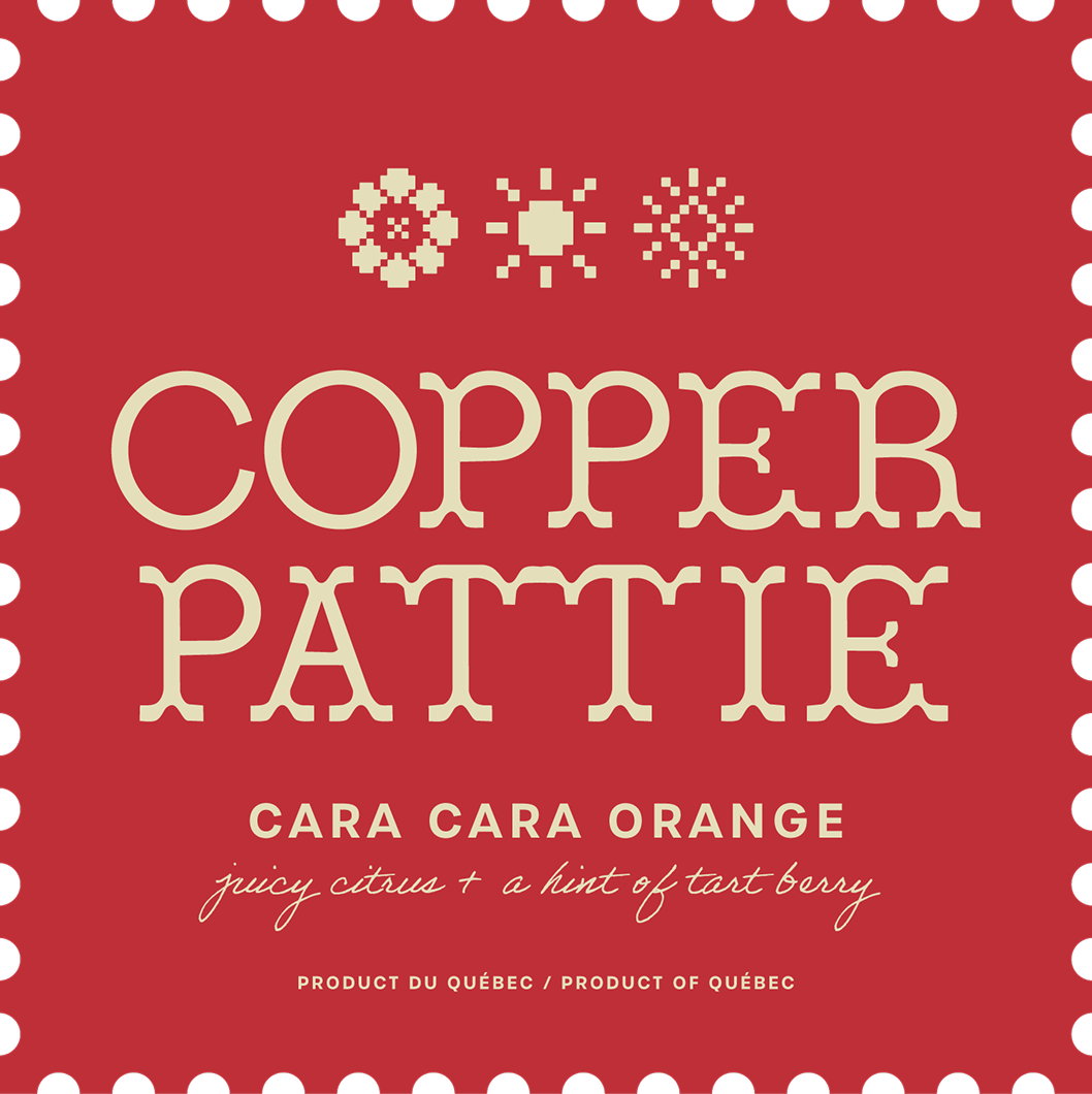
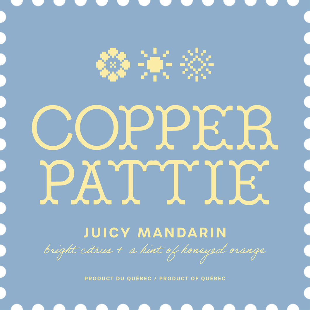
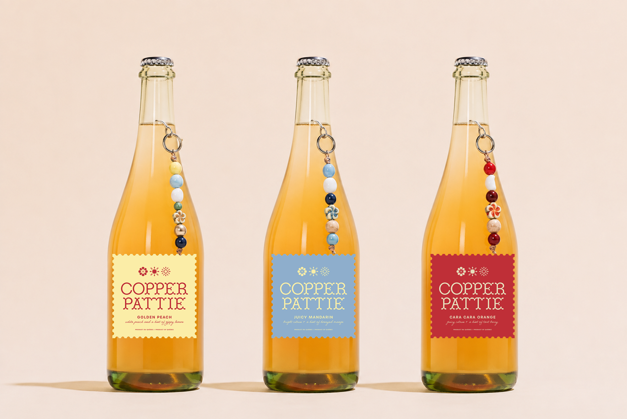
Taking inspiration from Kelly’s color palette, Jenna started designing three different label options for three juicy flavors. She also added a beaded charm to each bottle.
In normal circumstances, she’d have spent more time mocking this up and creating custom charms with colors that reflected the tasting notes of each flavor. But alas, if only we had more time!
Lesson learned: trust your instincts
This was such a fun (and at times stressful) exercise for us. As creatives with different areas of expertise, we sometimes get caught in the dreaded echo chamber. Is this name terrible? Do we even like these colors?
Questions swirl around in our heads and good ideas don’t always see the light of day.
But with only an hour each, we were forced to trust our first instinct and present work we weren’t 100% certain of.
And we think the result was pretty darn good.
HOWEVER, we were also keenly aware of all of the ideas we’d have loved to have explored, but didn’t have time to. It’s worth noting that the first idea isn’t always the best one. Sometimes iteration, collaboration, and refinement truly does create something special.
As they say, good things take time!
We’d love to hear from you: did you like the brand we came up with?
What might you have done differently?
