“People perceive what they see as truth”
Over the past year, we’ve had the pleasure of leading several branding projects in the public sector, working with municipalities, libraries, and other civic organizations.
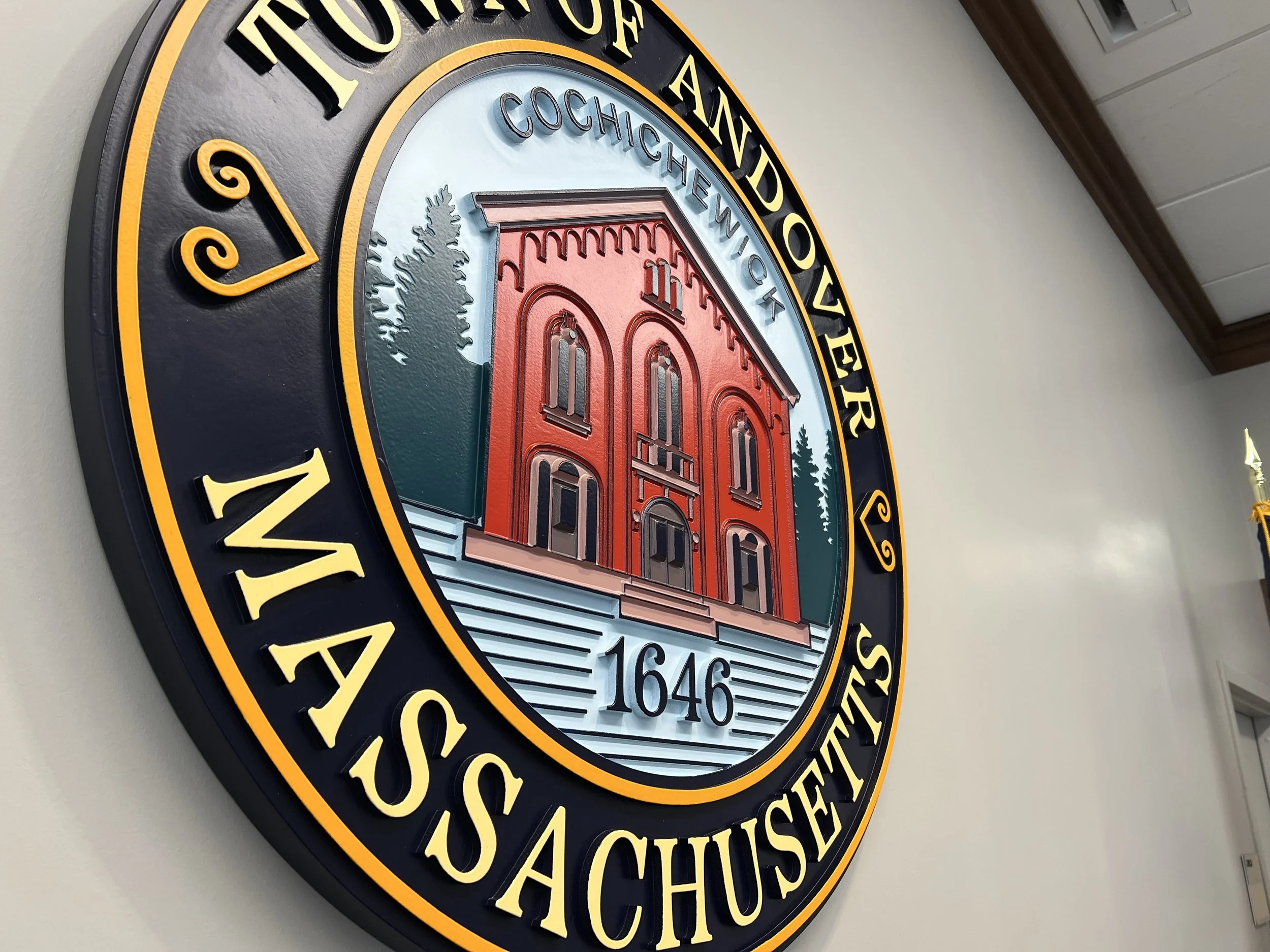
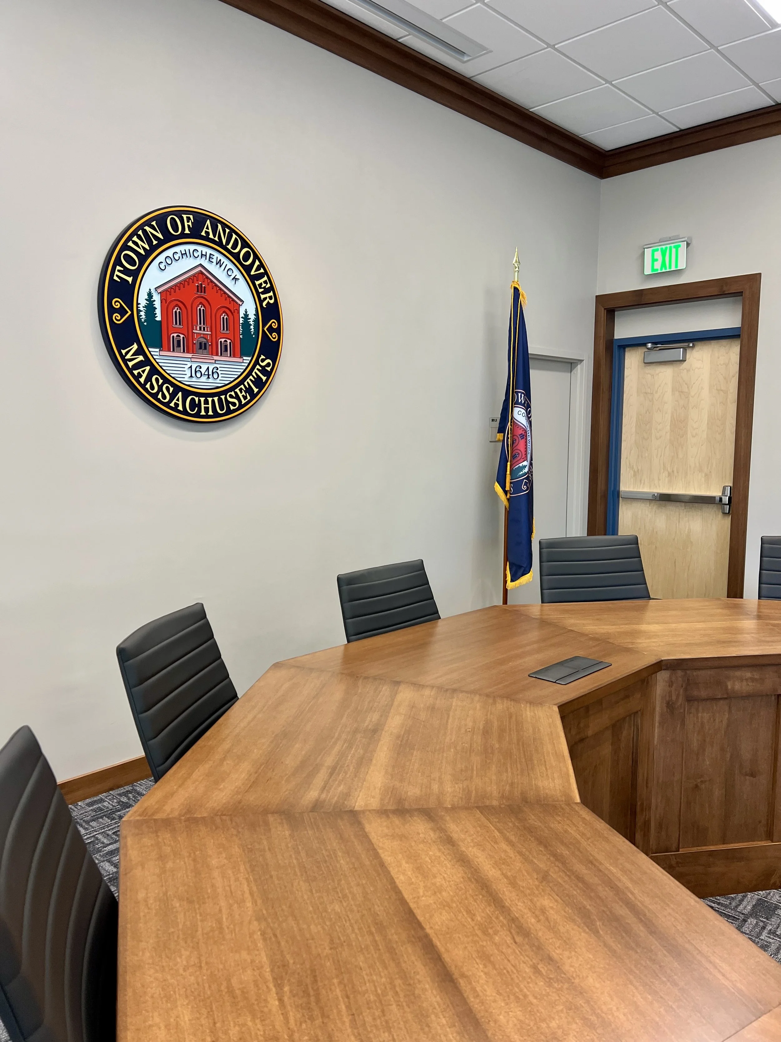
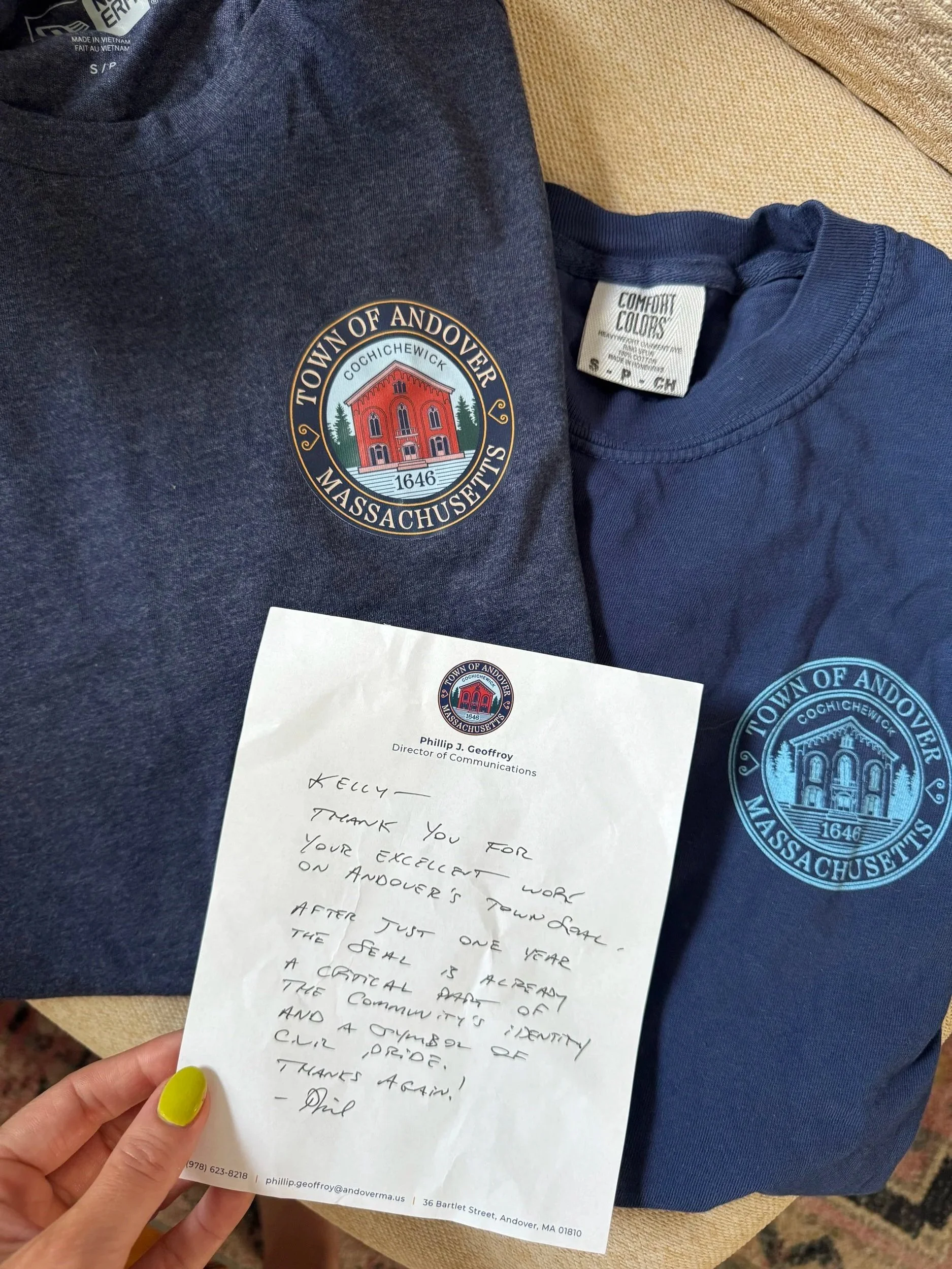
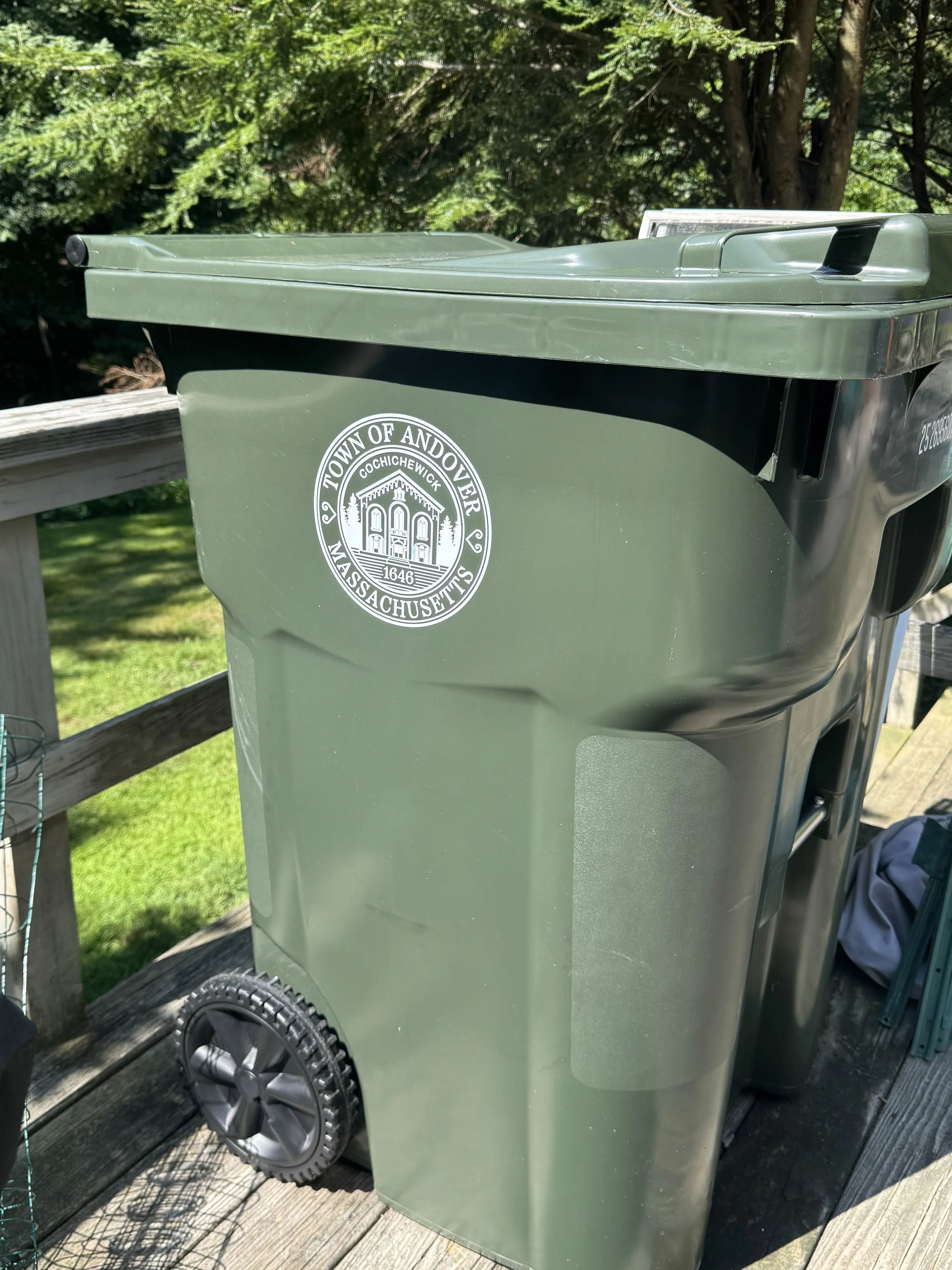
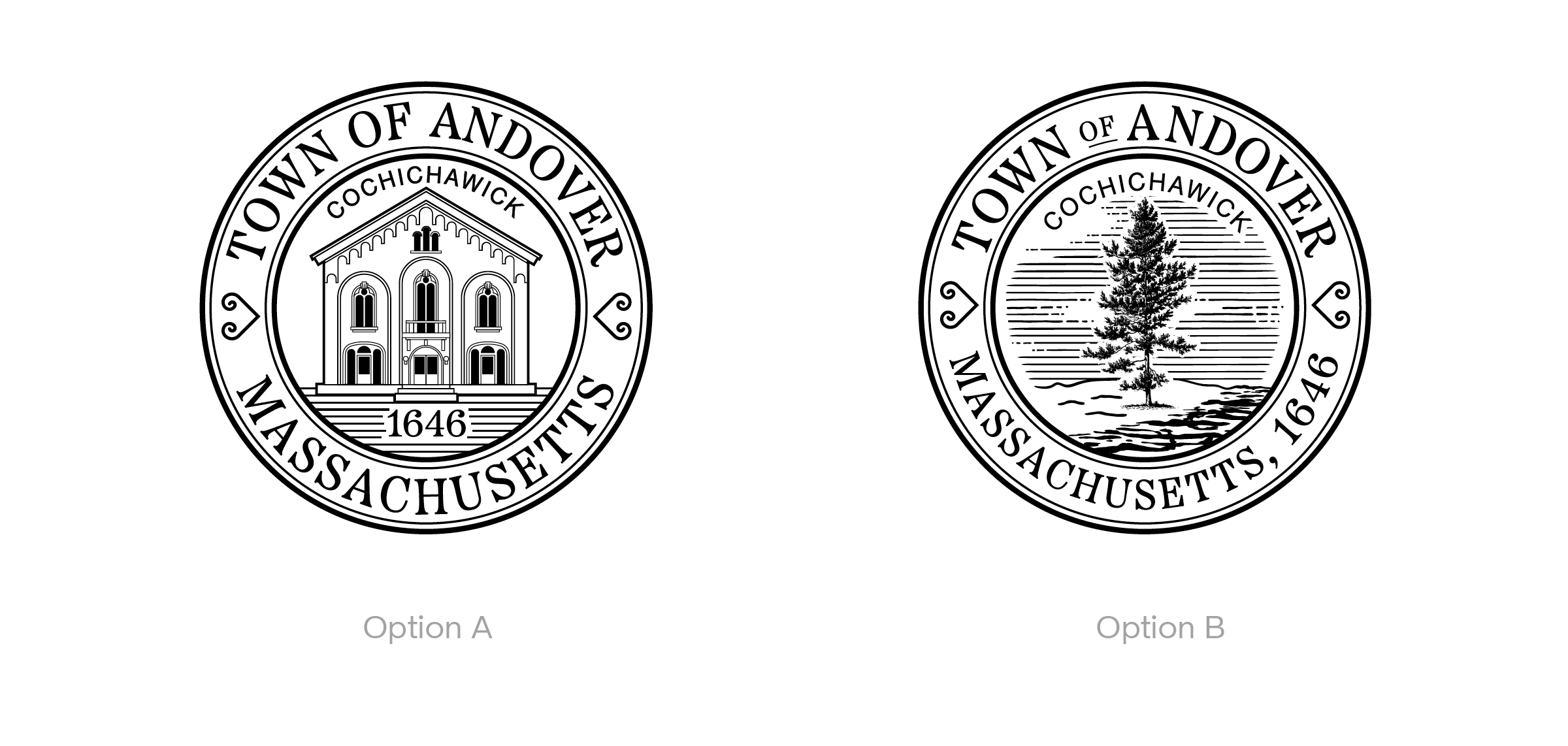
The seal we designed for the Town of Andover in 2023.
At first, we approached these projects like any other. But we quickly realized that they had different needs and constraints than the clients we typically work with.
Because branding in these spaces isn’t really about “marketing” in the traditional sense. These organizations aren’t trying to sell a product or maximize conversions. Their goal is to build trust, communicate clearly and efficiently, and connect with diverse audiences that span generations.

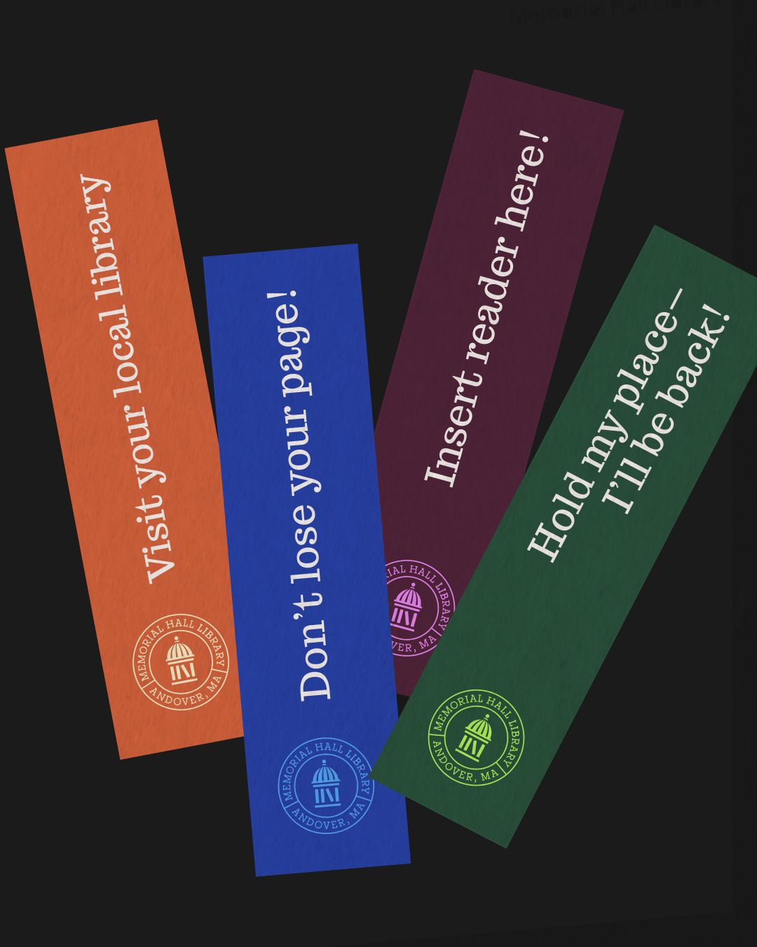
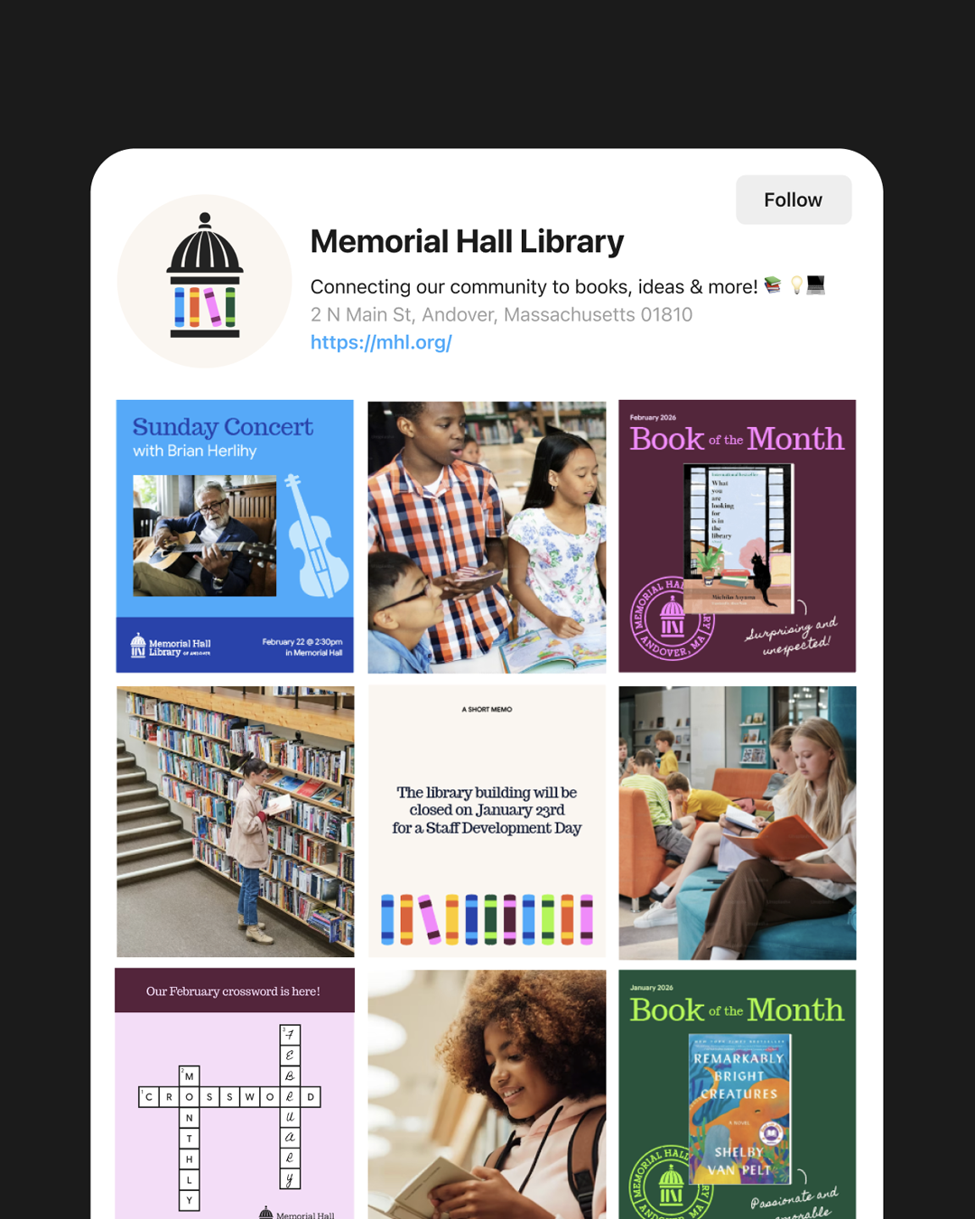
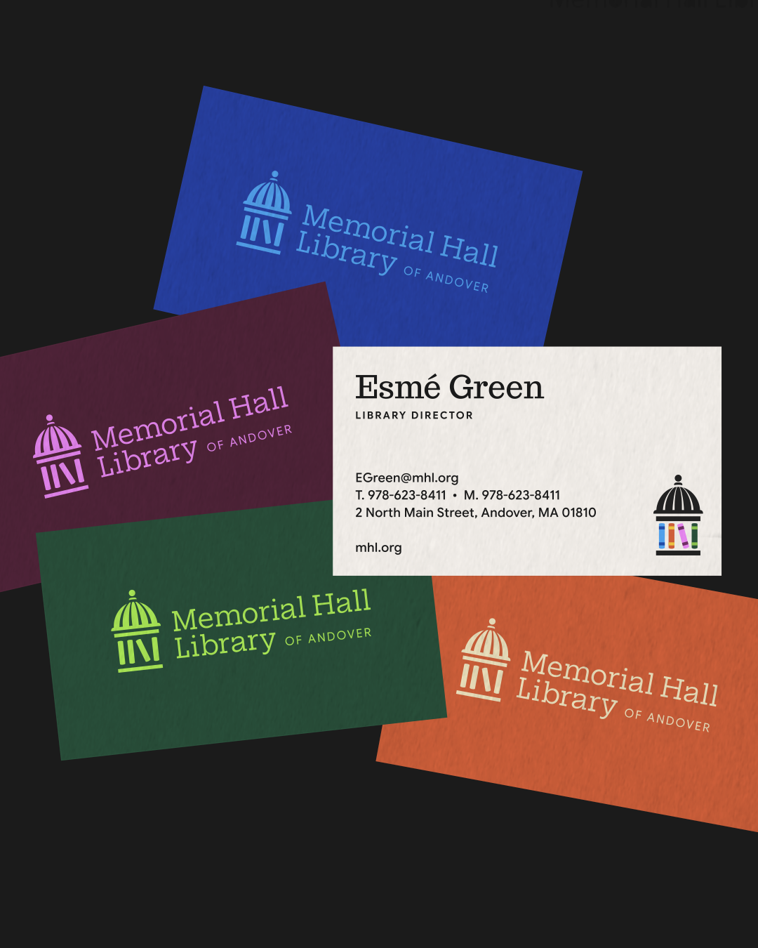
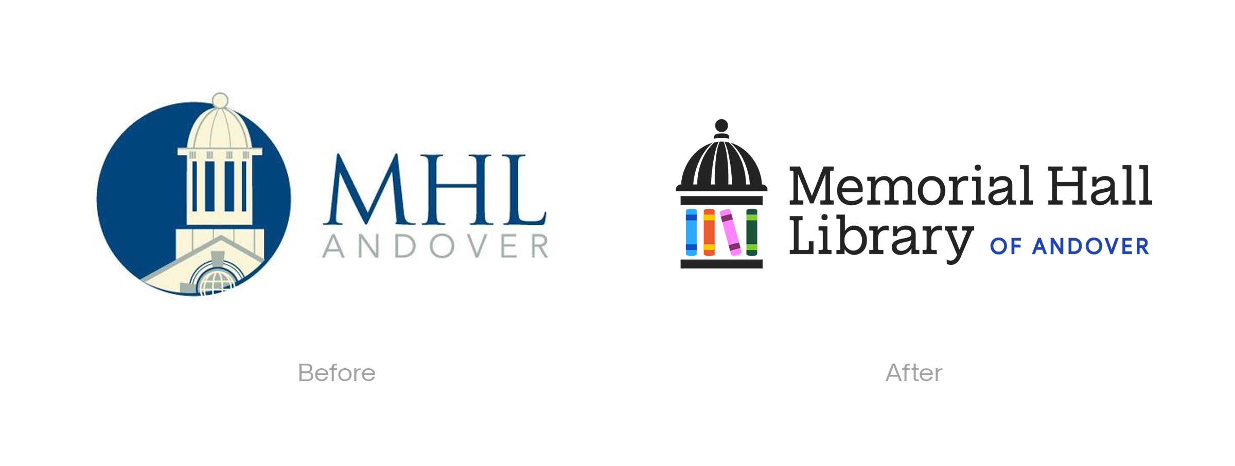
Branding we created for the Memorial Hall Library in Andover, MA.
Client Q&A
Typically, a brand’s consumers are united by their affinity for a specific product; they’re often in one age group, have similar purchasing tendencies, and aesthetic preferences. In the public space, what connects that audience is geography.
When branding for a municipality or public institution, you’re having to appeal to people of all different ages, with entirely different brand sensibilities, interests, and tastes. It’s a totally different challenge. And one we’ve loved taking on.
To dig into this topic further, we sat down with AGP co-founder Kelly Freitas and design advocate Phil Geoffroy, Chief Communications Officer & Director of Strategic Initiatives for the town of Andover.
Here are a few of the biggest insights from that conversation.
Q: What makes branding in the public sector fundamentally different from branding for commercial companies? Why is it valuable?
Kelly: One major difference is resources. Most public sector organizations don’t have dedicated marketing or design teams, or even a designer on staff. Often, branding becomes something an operations or communications person is tasked with doing, on top of their usual workload. It’s usually an afterthought, as most folks are trying to spend the resources they do have on programming and the services they provide.
Truthfully, there’s a low bar for design in this space. It’s seen as a “nice to have,” not a “need to have,” which makes good design so much more impactful.
Because people perceive what they see as truth. If a logo or website looks outdated, then people assume that the services themselves are dated or irrelevant, even if they aren’t. This is particularly true with younger demographics that are highly brand-conscious.
Design in these spaces becomes less about aesthetics for aesthetics’ sake, and more about communicating trust and credibility, increasing engagement, and improving accessibility. It fundamentally changes how people understand the service that’s being provided, and that can be really powerful.
Phil: I think organizations that are most successful in this area are ones that recognize that branding and design are not separate from public service.
Creating well designed materials and platforms is increasingly important because fewer interactions between residents and government take place in person. A lot of transactions that individuals may have once had to go to town hall to complete, like paying bills or applying for permits, now take place online. As a result, people form impressions of their local government through the documents they receive, the websites they visit, the signs they see, the forms they complete, or the social media posts and emails that land in their inbox.
Design touches all of those experiences directly.
When design is used in a consistent manner, it makes government feel more accessible and professional. Ultimately, if done right, it can make residents feel more confident that the organization serving them is capable and reliable.
Q: What are the main challenges when branding in the public sector?
Kelly: The audience is so broad! Usually, we develop one “bullseye” ideal persona for our clients, but in the public sector you have to design, not just for multiple audiences, but for several generations, all with completely different relationships to media, design, and technology.
There’s also a lot of emotional attachment to history and tradition, which can sometimes make change feel threatening.
So the challenge for us is: how do you modernize something without losing the trust and familiarity people associate with it?
We’ve found that the best designs are usually thoughtful evolutions of existing ideas.
For a public library project we worked on this year, we were inspired by the architecture of the building and ended up integrating that into the design of the logo. For a public access TV station brand identity, we integrated that town’s colors into our palette in a way that felt modern and unexpected, but familiar.
Phi: Also, there’s a need to get the public involved in the process. If replacing a longstanding symbol, as we did in Andover with the Town Seal, for example, direct engagement through forums, surveys, and historical research is essential so the final design feels authentic rather than imposed.
Outdated and frankly poor design can occasionally be mistaken for heritage just because it has existed for a long time, even if it was not truly created through a thoughtful process. In those cases, it is important to clearly explain how an updated design can better reflect the community’s values and still respect traditions people care about.
Q: “Has this work changed how you think about branding overall?”
Kelly: It’s really reinforced the idea (one that I’ve believed for years) that branding isn’t just decoration. It actively shapes how people experience an organization.
And unlike many for-profit companies that evolve constantly or change their look every few years as consumers’ tastes change, these identities often last for decades. So we’re not designing for a three-year trend cycle, we’re creating something that has to feel credible and recognizable for a very long time.
That’s pushed us to think more deeply about longevity, accessibility standards, and legacy across every project we take on (not just those in the public space!)
It’s also reminded us that sometimes the best ideas come from those “gold nuggets” that are specific to the people and place behind the organization. We love uncovering those gems in our discovery conversations and then creating something that really resonates with the founders, employees, and audience as a result.
Why this work matters
One of the most interesting things we’ve learned while doing these projects is that public sector organizations and non-profits seem to understand something that many private companies forget:
Trust is built through every interaction.
It’s not just the service itself, it’s the website someone visits, the form they fill out, or the sign they walk past.
Good branding doesn’t just make an organization look better, it can fundamentally change someone's perception of that service, and help them feel more confident engaging with it.
We’ve loved working on these projects in the public sector, and seeing how the standard for design continues to rise in these contexts. Because public spaces deserve thoughtful, strategic, beautiful design, too.
If you're looking to advocate for design for your towns institutions, or have your own business and would like to chat, we'd love to chat!
You can book a free 20-minute call, here.
